Confidential client (multi-tenant calendar and impact SaaS for nonprofit coalitions)
Turning a UX Audit Into a Working Prototype
Most audits end as a slide deck the client cannot really act on. This one shipped as a working prototype they could click through the same day. I reviewed a shared-calendar app for nonprofit coalitions, then rebuilt the experience in a couple of hours so the value was obvious instead of theoretical.
Project Details
- Timeline
- One working session (a couple of hours)
- My Role
- UX Audit, Product Strategy, Design & Build
- Key Focus
- Turning a UX audit into a working, accessible prototype in a single session, so the client could feel the strategic fixes instead of reading about them.
The Challenge
I opened the app and it worked fine. That was not the issue. The issue was who it was built for. Engineers built it, and the people who actually had to use it day to day were nonprofit staff and government partners, not full-time software users.
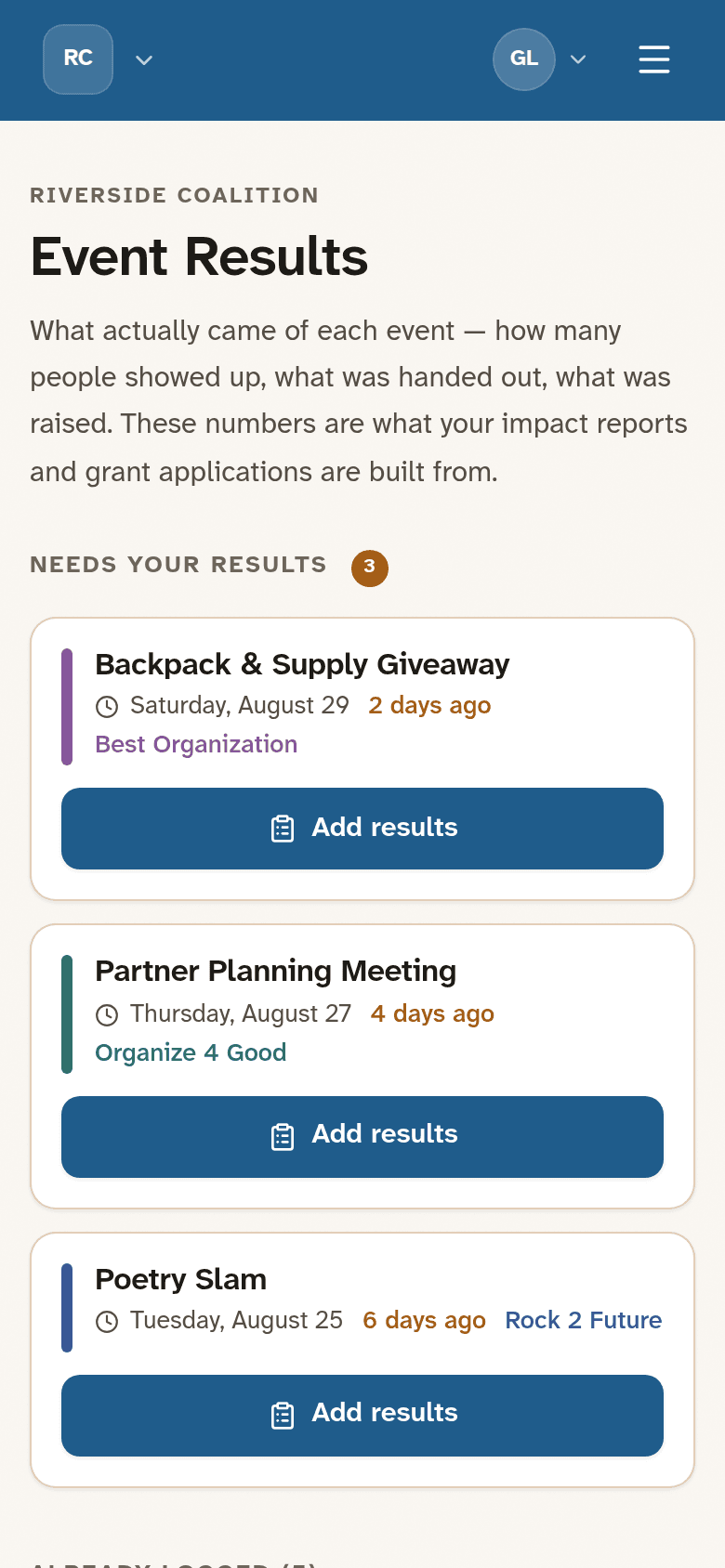
Signing in dropped them onto a bare calendar, or worse, an admin screen printing raw backend data. There was no home to orient anyone, no obvious way to start a coalition, invite partners, or approve someone asking to join. Event results, the thing funders actually care about, were logged through "Key" and "Value" fields buried inside the create-event form. You were basically asked to record attendance for an event that had not happened yet.
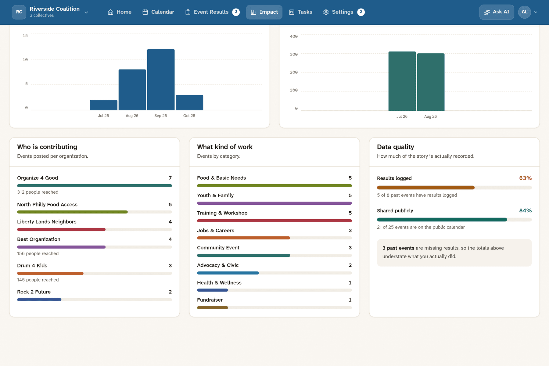
The dashboard counted events and called it impact. Colors meant one thing in one place and something else in another. On a phone, the calendar was rough. None of that was going to land with a low-tech audience, and a 20-item audit document was not going to change it either. A list of problems is easy to nod at and hard to feel.
The Solution
So I did not write the 20-page document. I rebuilt the thing.
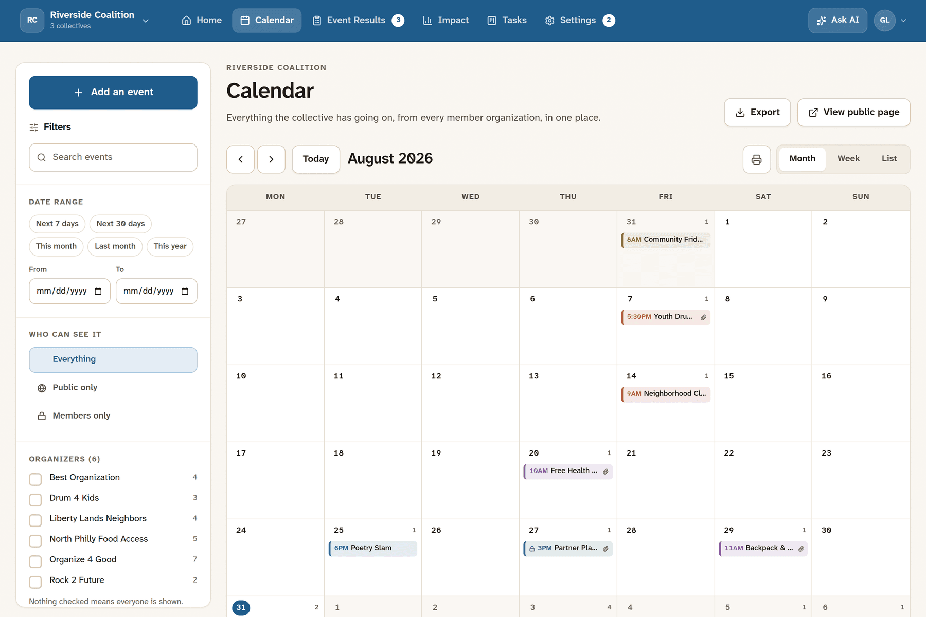
In a single working session I turned the audit into a clickable prototype on the client's own stack, seeded with realistic demo data so anyone could open it and look around with no login and no setup. The goal was to let the client feel the fixes instead of reading about them.
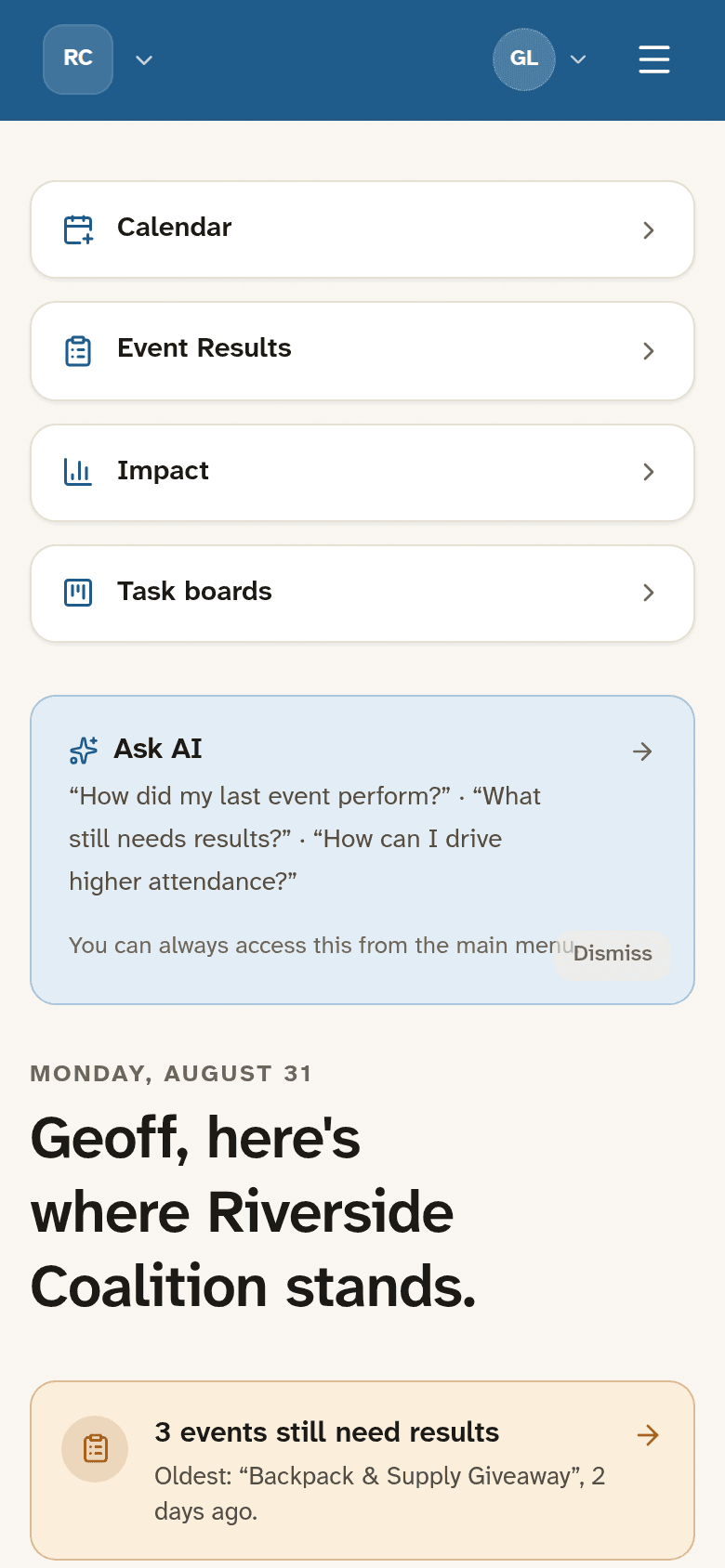
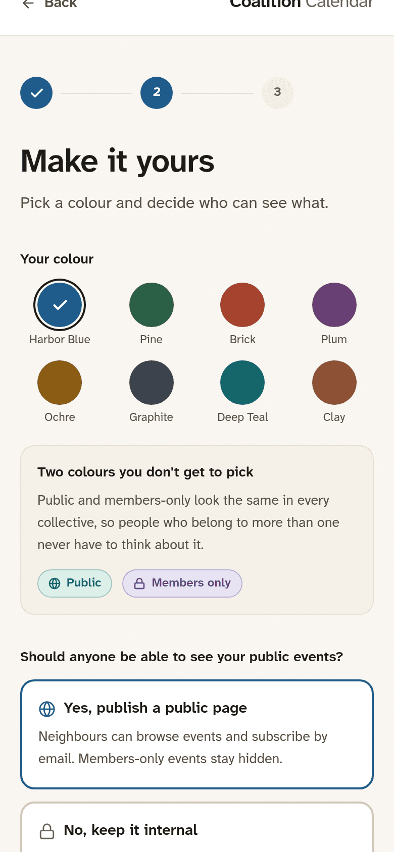
A few decisions did most of the work. The first was treating accessibility as a brand choice, not a checkbox. I moved the whole app onto Atkinson Hyperlegible Next, one of the most legible typefaces made, which also gives it a calm, distinct look instead of the usual AI sameness.
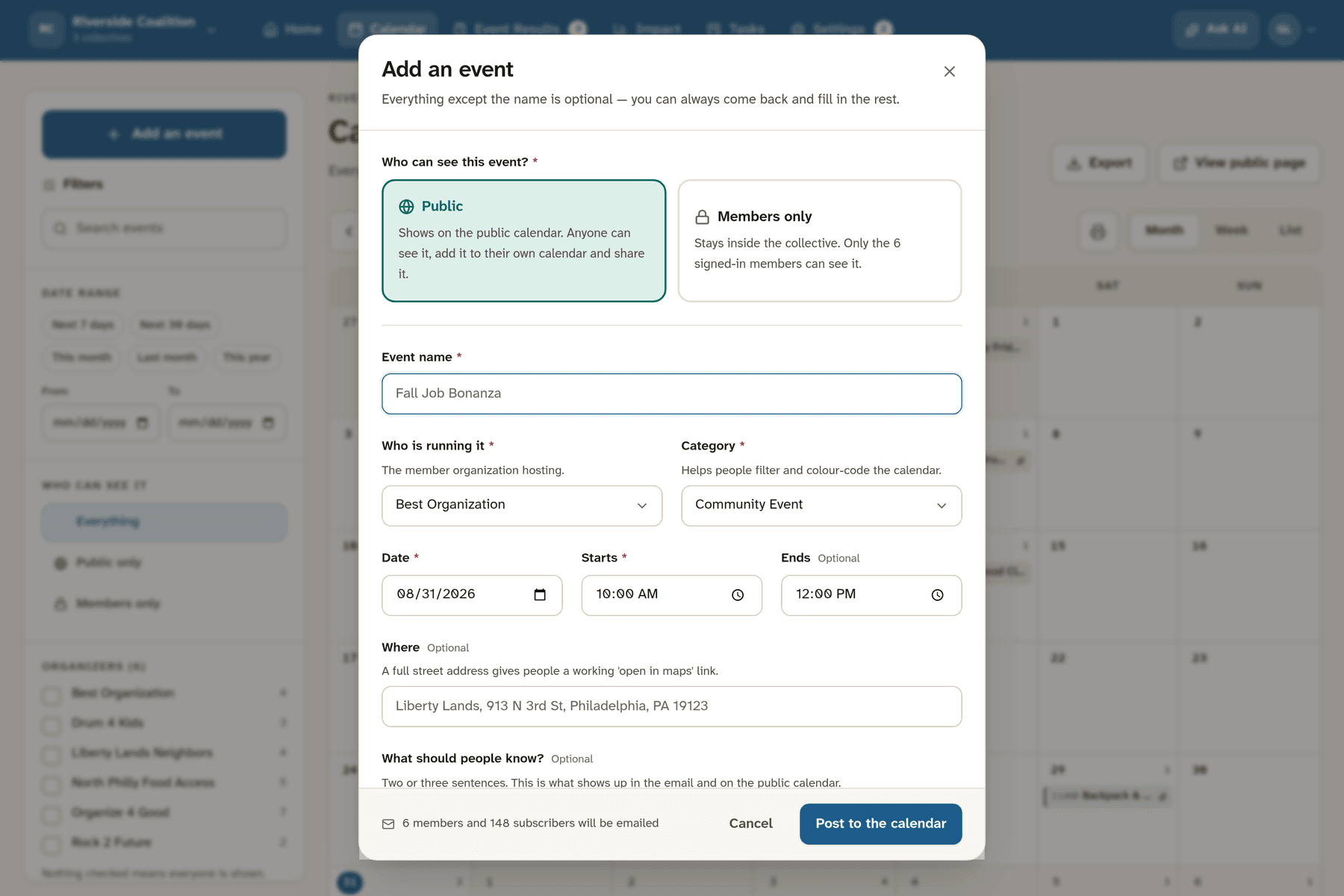
Public and members-only also stopped being a color you had to memorize. Now it is a color, an icon, and a word, every time, so the meaning holds up for someone who is color-blind, printing in grayscale, or juggling three coalitions at once.
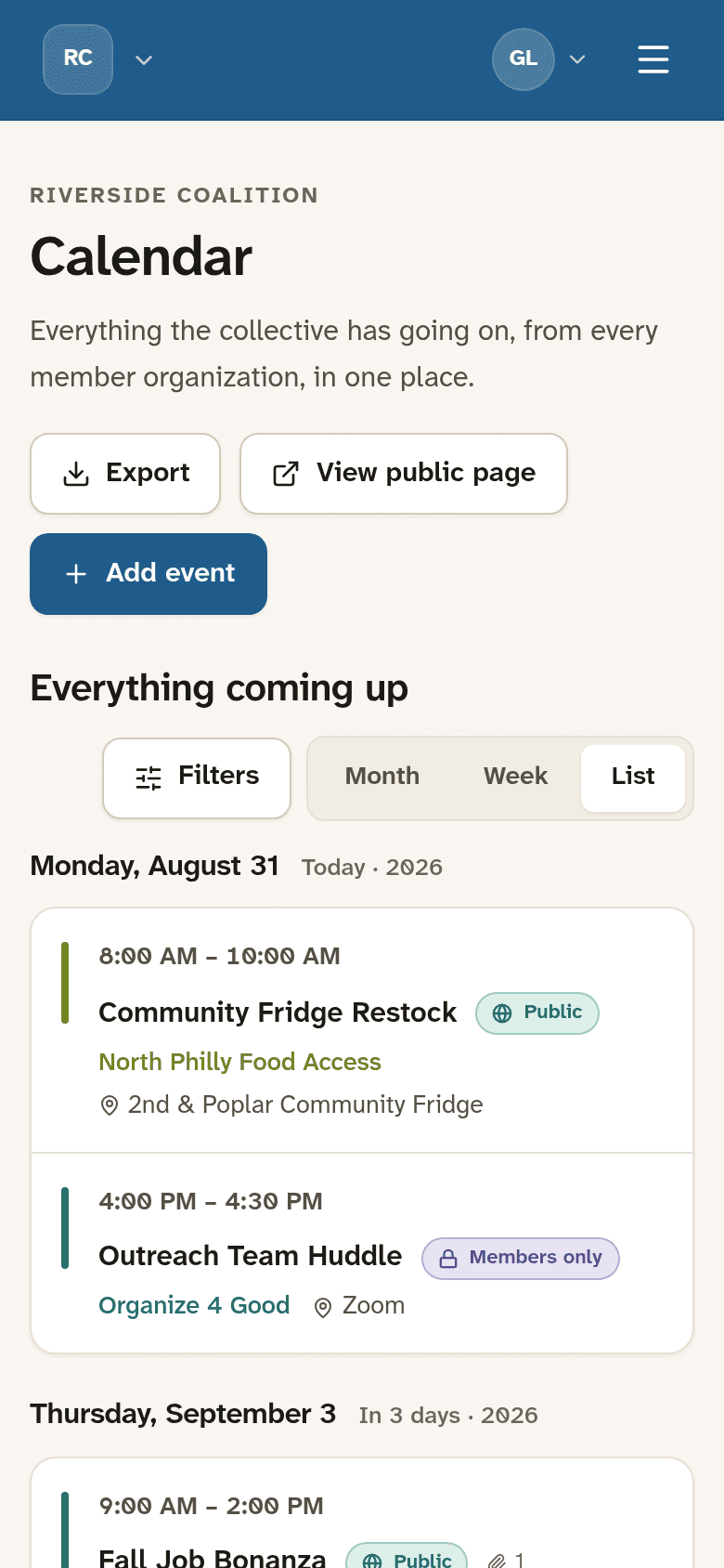
The second decision was giving the app a spine: a home that shows what actually needs you, a create-event flow that asks who can see this before anything else, and a calendar that works on a phone instead of just tolerating one.
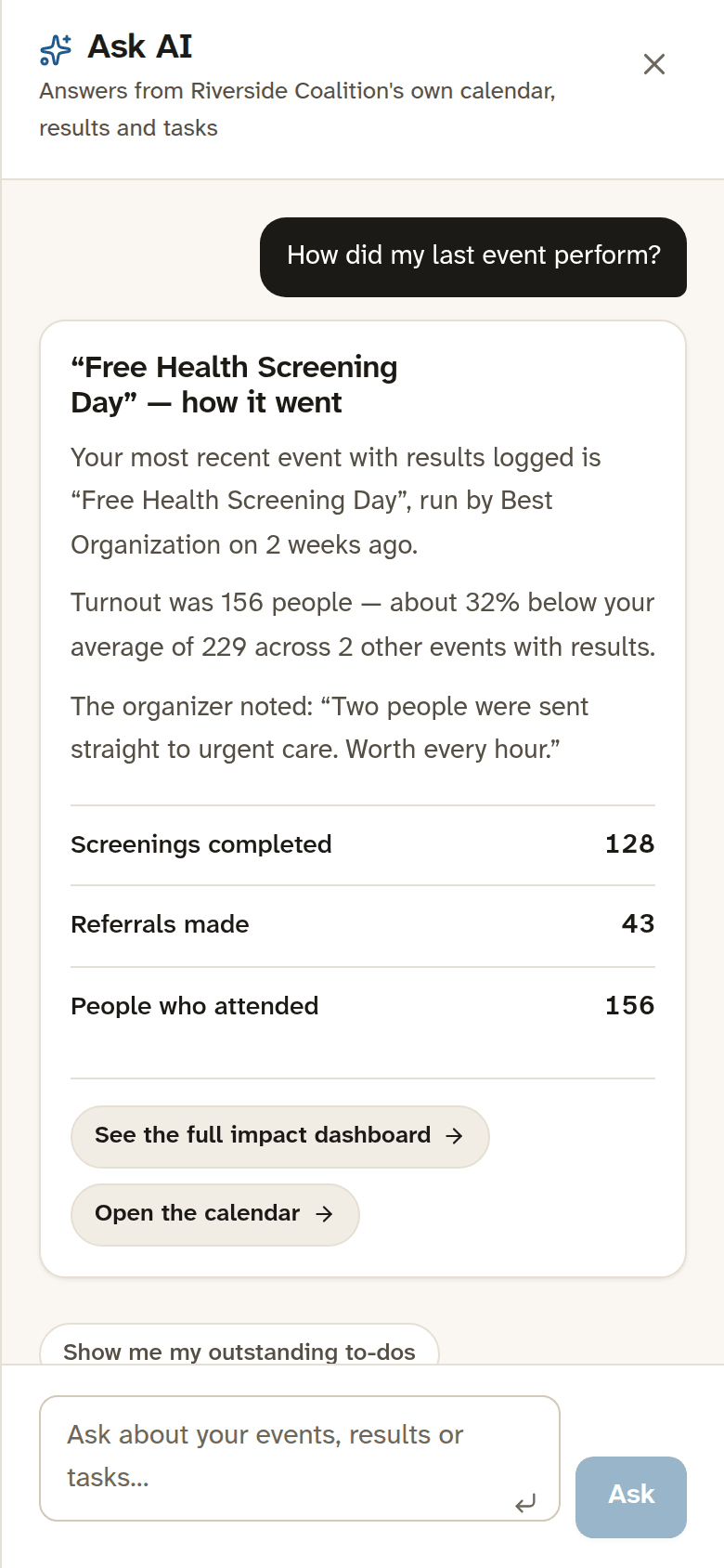
The third was the accountability loop, which is the real product here. Post an event, record what came of it, and watch it roll up into a funder-ready view. I pulled results logging out of event creation and gave it its own queue, so you record outcomes after the event, when you actually know them. The impact view leads with outcomes and, unusually, tells you how complete its own data is instead of quietly overstating the total.
I also built for the handoff, not just the demo: a documented database schema, a single place in the code where the mock data swaps for a real backend, and a written walkthrough so a non-technical client can give the tour themselves.
Technologies Used
- React
- TypeScript
- Tailwind CSS
- Vite
- React Router
- Supabase
- Atkinson Hyperlegible Next
- Claude Code
Project Visuals
The Results
The client walked away with something they could put in front of their own stakeholders that afternoon: a product to click instead of a document to interpret.
The bigger win was the reframe. An audit tells you what is wrong. A working prototype shows you the fix and what it feels like to use, and that is the part that actually moves a decision.
It is built to last past the demo too. Because the data layer sits behind one swap point, the same interface can move to a real backend without a rebuild. The accessibility work, the fixed status system, and the results-to-impact loop are the parts I would carry into production first.
- ~2 hrs From audit to a clickable prototype
- 13 Screens redesigned and built
- 0 Backends needed to demo it (runs on seeded data)
Areas of expertise
- UX Audit
- Rapid Prototyping
- Product Strategy
- Design Systems
- Accessibility
- Multi-tenant SaaS
- Civic / Nonprofit Tech